
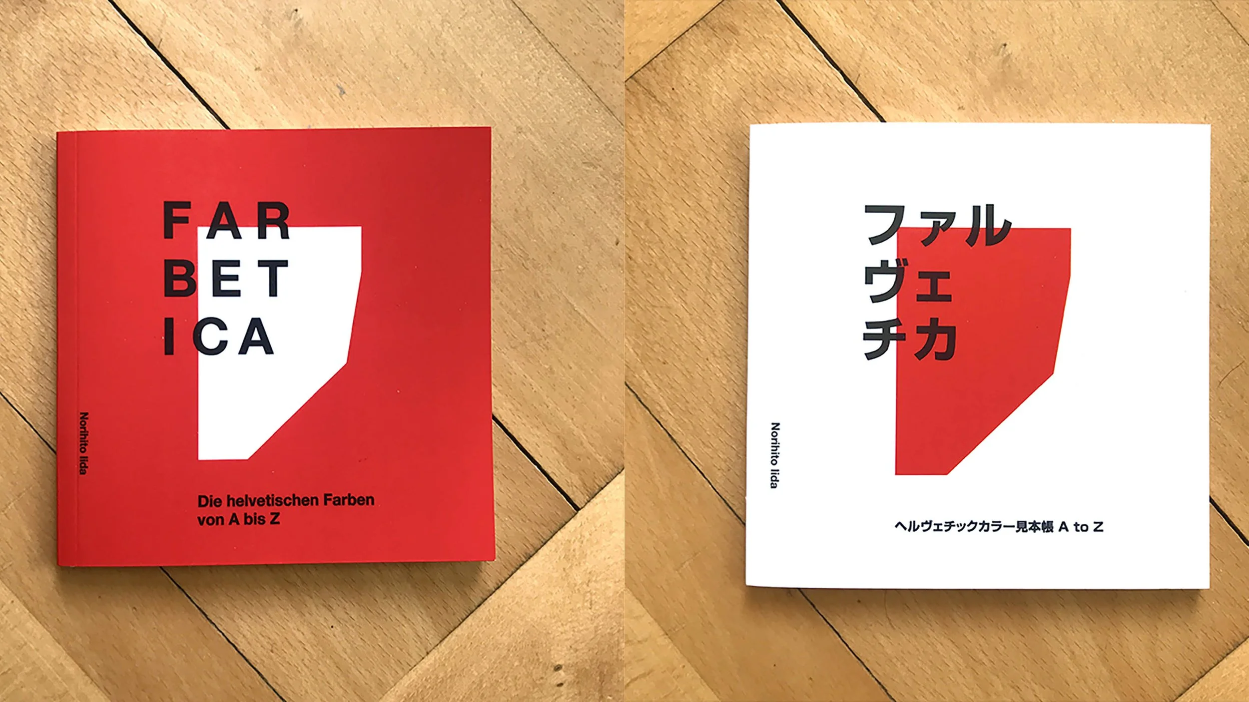
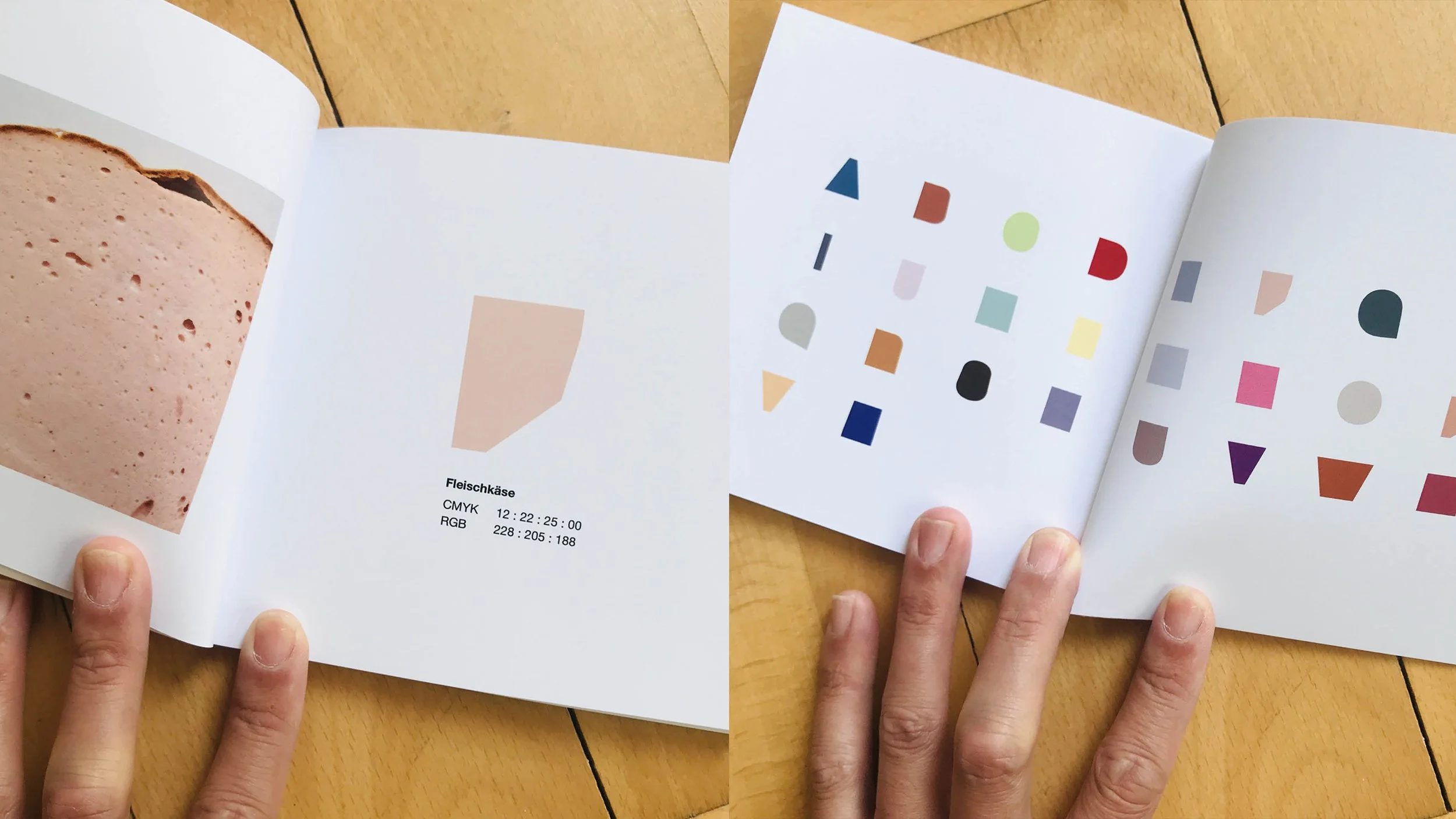
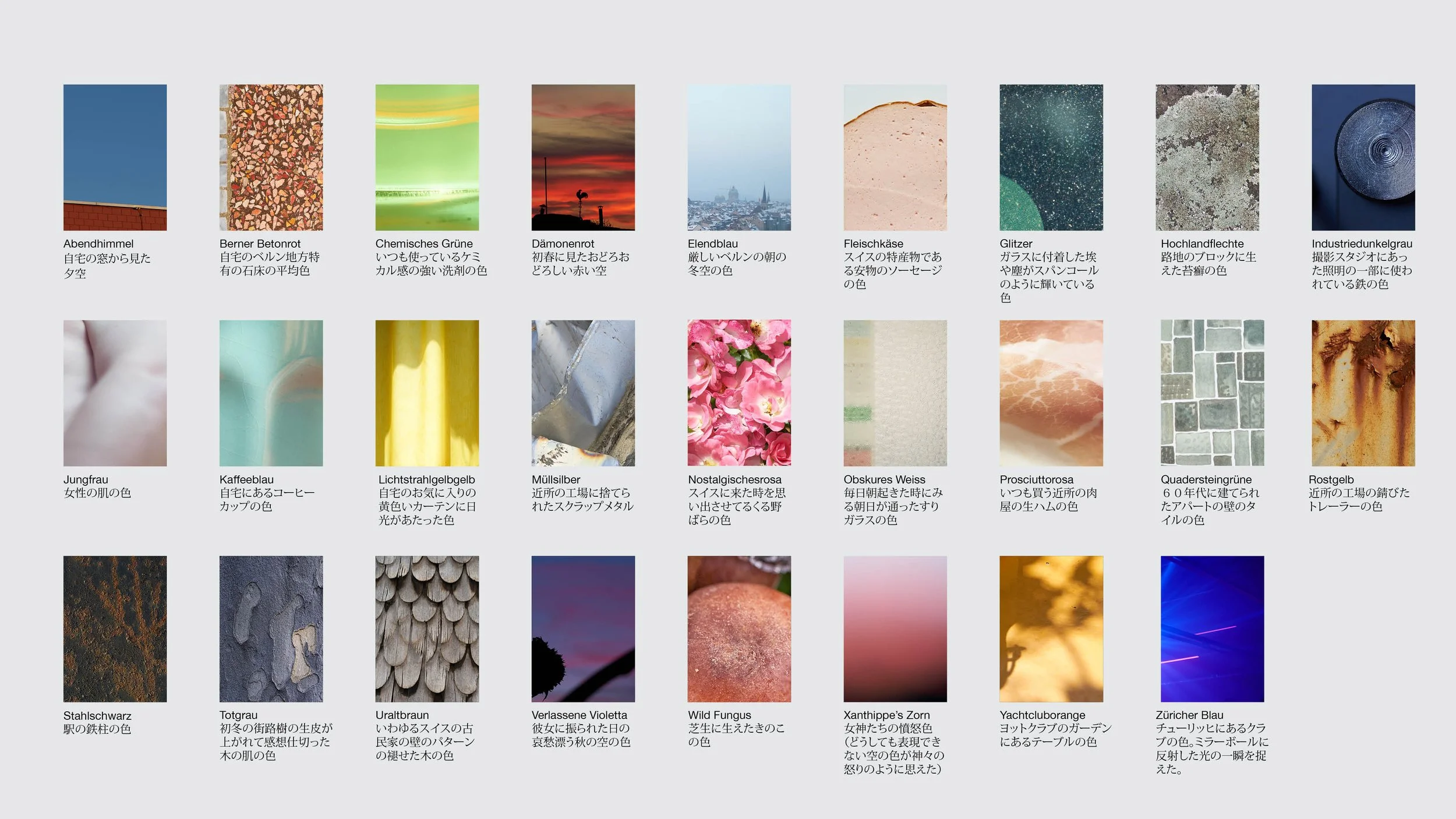
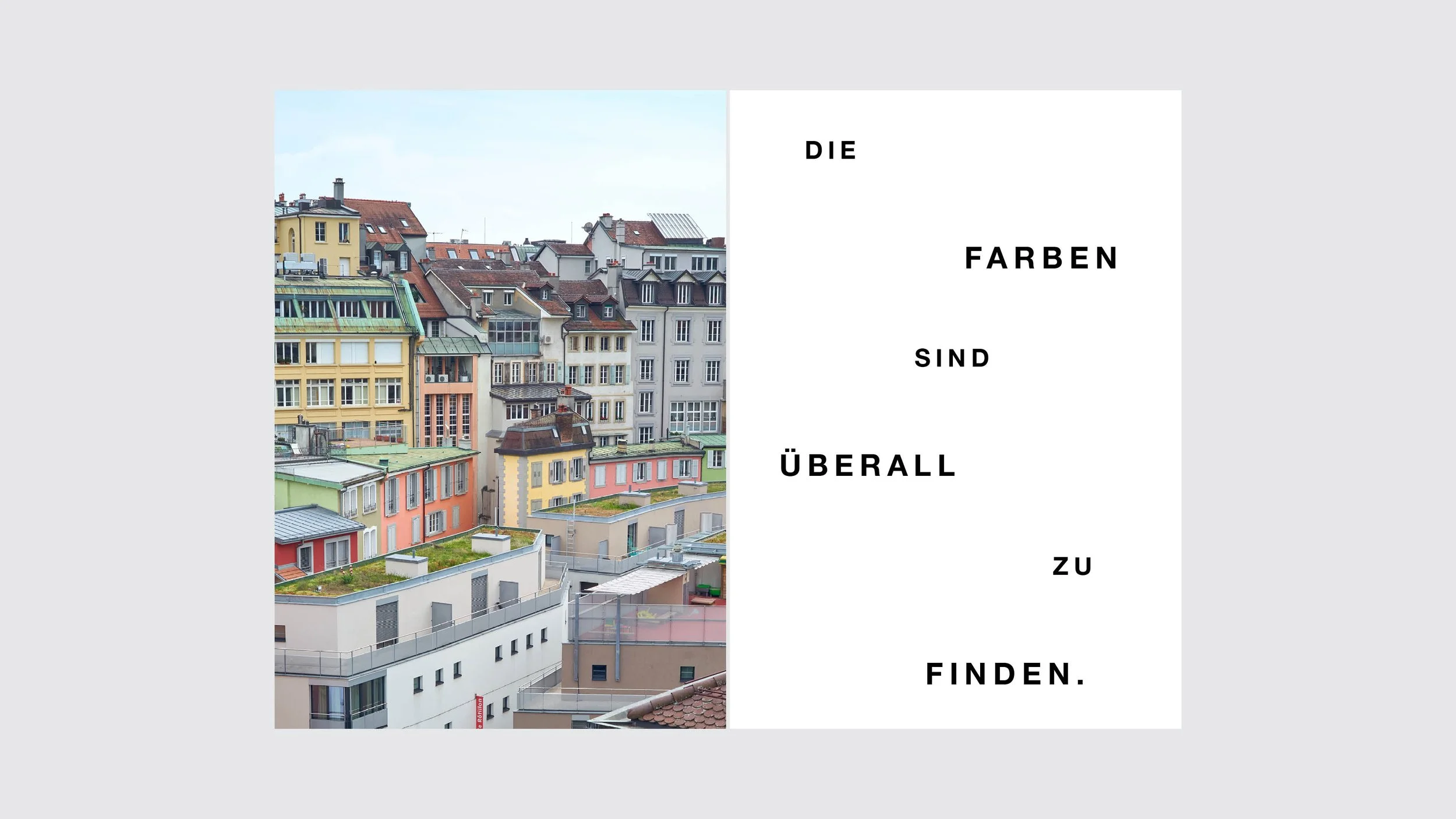
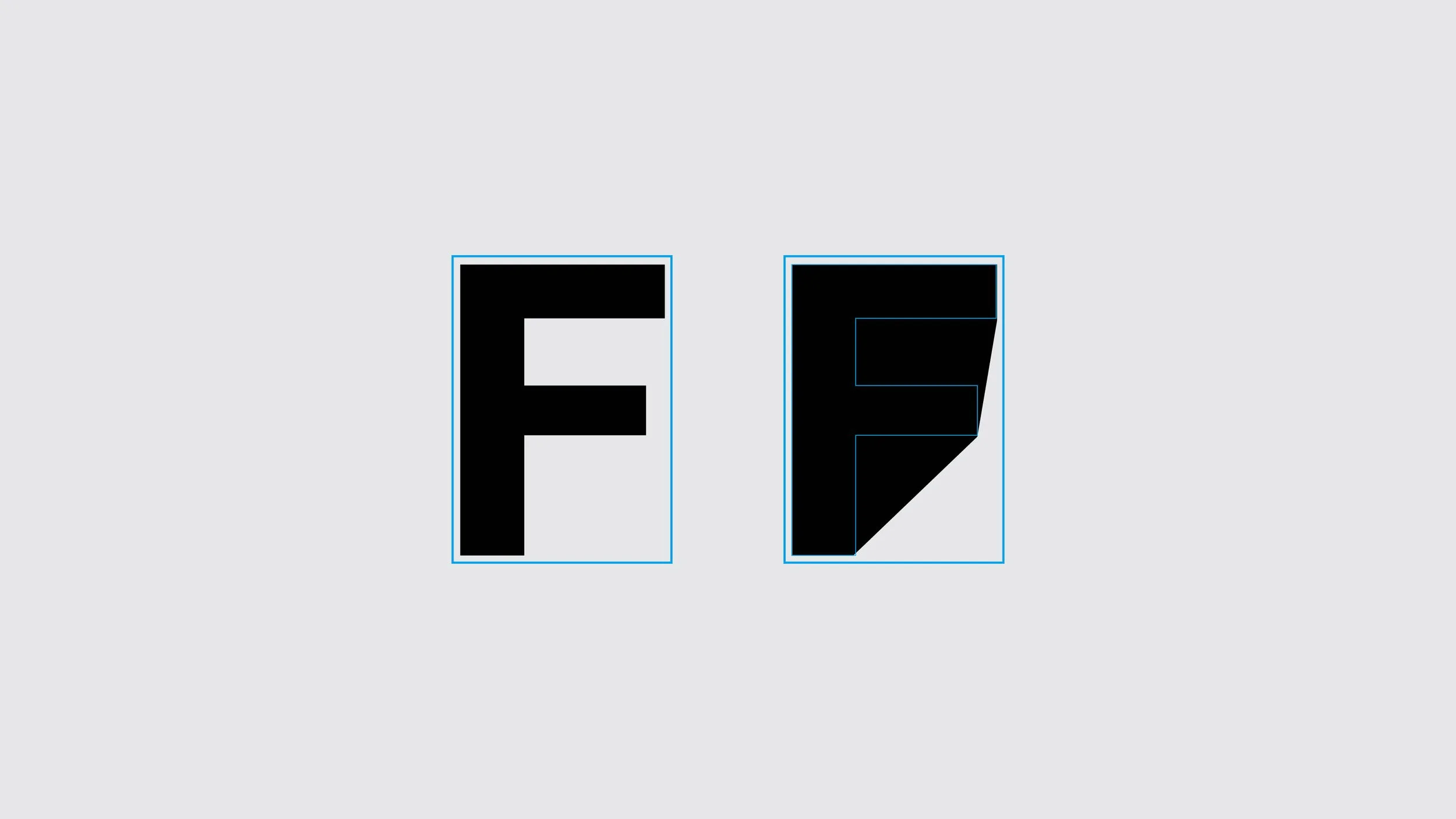
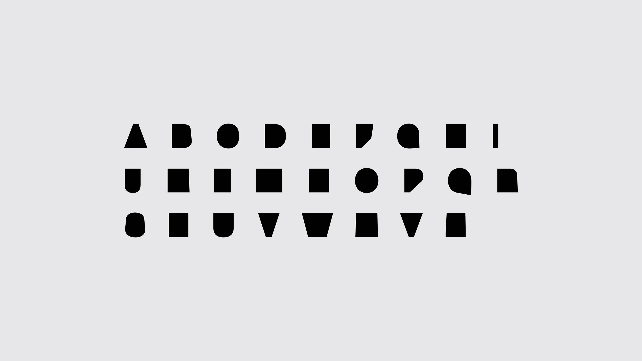
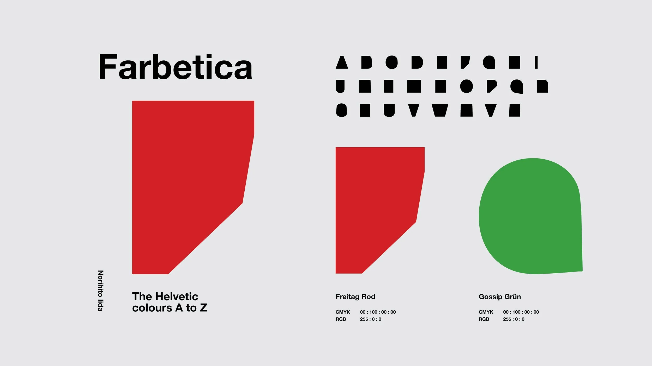
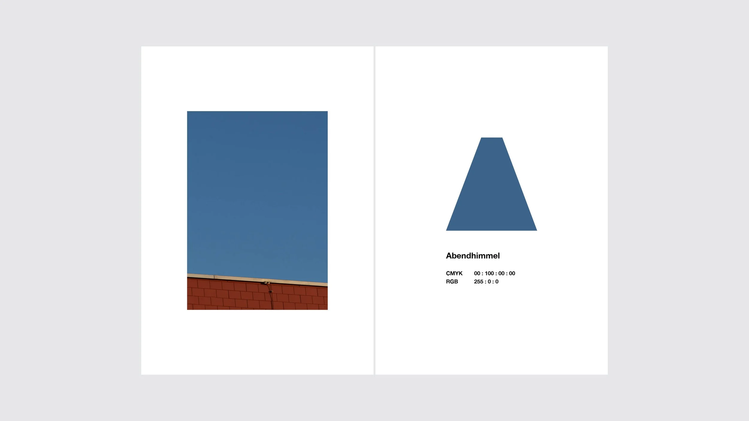
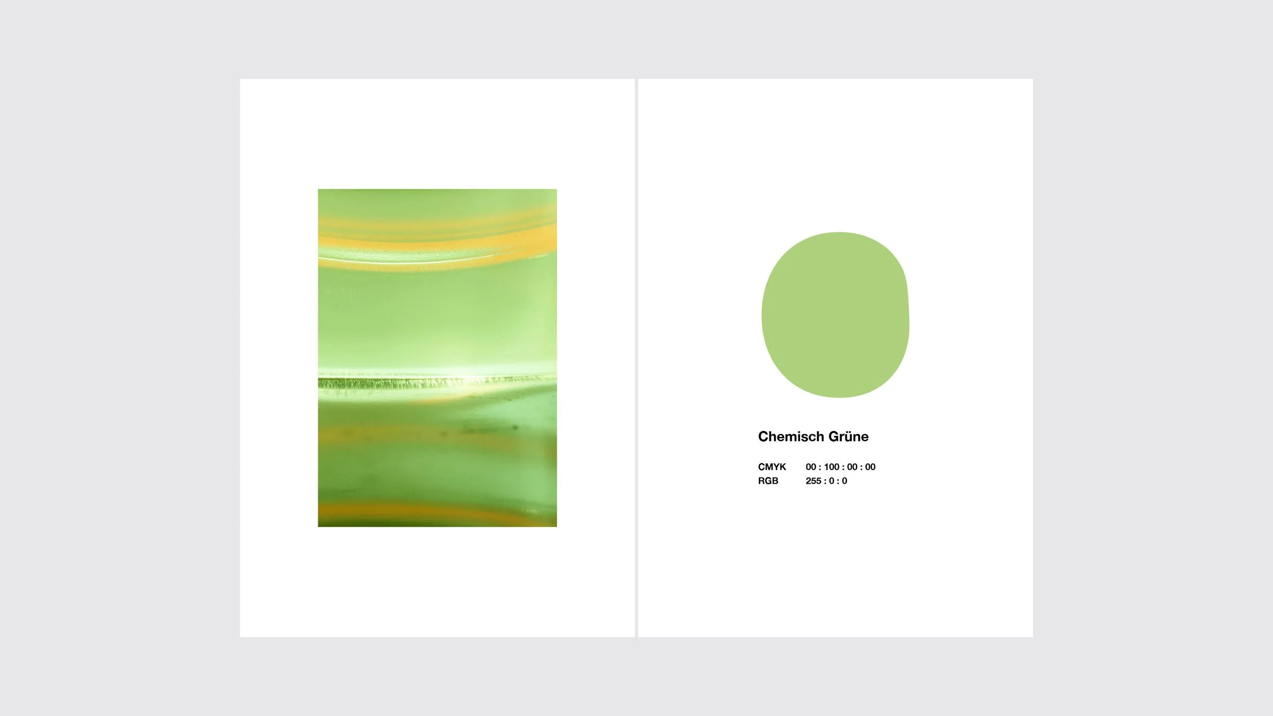
During my time in Switzerland, I conceived the idea of capturing the colors of everyday Swiss life and creating a color guidebook. From a multitude of colors observed through my personal lens of Switzerland, I meticulously selected 26 colors and assigned them unique names, arranging them alphabetically. When designing the book, I developed a "typeface" consisting of 26 shapes to serve as containers for the colors. This innovative "typeface," named FARBETICA, draws inspiration from the globally recognized Swiss typeface Helvetica and is specifically designed for reading colors.
FARBETICA
The helvetic colors
スイスの日常生活を通して見えてくる色彩を捉え、カラーガイドとして収録したデザインブック。 自身の眼を通して観察した多数の色から厳選した26 色を名付け、アルファベット順に整理した。 本をデザインする際、色の受け皿として26種類 の形からなるオリジナルの「色書体」を開発。 FARBETICA と名付けられたこの革新的な「色書体」は、世界的に認知されているスイス製の書体 Helvetica からインスピレーションを得ており、色を読み取るだけのために設計されている。
Client
Personal Design Project
Credits
Art Direction: Norihito Iida
Design: Norihito Iida
Photography: Norihito Iida
